Thursday, 5 March 2009
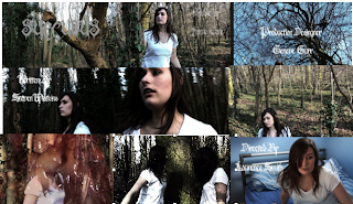
9 Key Frames
Frame 1- Is a Location shot the sets the location and the mood of the film as its a wood and its dark many people associate dark woods with horror.
Frame 2- is showing the main chracter and her outfit is very plain and simple it looks like night wear. she looks around in cofusion like shes is lost this build tension as you don't know what is going on at the moment in time.
Frame 3- Is more establishing shot also that the shot rotates makes it feel weird and like its not real or something.
Frame 4 is high shot showing variety confusion as its in a weird angle and the girl looks very confused
Frame 5- Is a tracking shot as she looks around trying to figure out what is going on.
Frame 6- Is a very energetic shot as the girl hears sounds she panics as she trys to find out where it coming from.
Frame 7- is her walking but a image of a Heart appear this startles the audience as it only in 2 frames and it unpredictable.
Frame 8- is the girl walking into herself i used the simple clothes so you can identify the girl but now there is two so you know its the same person.
Frame 9- The switch of Location and the girl waking up ending the weird dream as the dull colour has been removed an now its all nice and bright contrast.
How does your media product represent particular social groups?
This is my Main Character. In this shot she woken up from her nightmare. She is wearing plain white night wear.
What kind of media istituation might distribute your media product and why? How did you attract/adress your audience?
Who would be the audience for your product?
Horror, because of the setting, music and loneliness + Screms
Horror,
I feel this because it's set in a forest and it goes from having one girl in the woods to two girls. then blood and guts, also with the creepy atmosphere and music i would defo say its a horror
Who do you think the 'target audience' of this film would be? Why?
people who like odd wired horror films also people who like a twist.
it's a bit random too, random people who like random things should like this.
i think the target audience is young people, beacuse its a young person in the film
What is your favourite image from this film? Why?
The heart flashing it adds a 'scary' effect.
When the two girls are side by side facing each other, I thought the way was edited and filmed was well done.
If you were to borrow one idea from this film for your own film making project, what would it be &why?
Flashing heart
The way it went from scary girl in the woods back to a diffrent scene to somthing like a dream
Jake and Jim's feedback
This is feedback we got from jake and jim two professional film makers.
What I have learnt about technologies from the process of constructing this product
I would like to improve my knowlage on After Effect and use it in my next project to get some great effects that would not be possible on any of the avalible Software. I will cheak online totrural on the web and ask people who ahve knoledge of the program
I would like to look and lern more interesting camera shot and how to co-ordinate each shot perfectly. How to properly organise a film shot so i can get the best result. Start to watch more film like some well known idependents for they seem to explore interesting shots then hollywood filmmakers so they can be noticed.
I need to learn how to use green screen so my possiblitys of film location and types can open up for more opitunities. Ask for a tutorial with teachers or other people to learn and get a chance to use it.
How i will Help Next time
In this Project i help a few people more with acting and only 1 or 2 people with technical issues. But i didn't help Sam, Alexander or Ash with there work. next project I look to wonder round the class and see if everyone's okay and if they need any help at all as there not going to ask me if i don't say I will help with anyone.
Wednesday, 4 March 2009
Looking back at your preliminary task (the continuity editing task), what do you feel you have learnt in the progression from it to full product?
During the making of my opening sequence i learnt a lot about the 180 degree rule and Continuity. in my film my character moves left to right for a while then slow rotates round so she going right to left. This is not sudden it gradually rotates which doesn't make it look out of place and wired.
Sunday, 1 March 2009
If I had One More Day To Edit
Evaluationon My Opeing Sequence
How does your media product represent particular social groups
My Product represent on the Dark Social Groups like Goths and Emos as its Dark and a Horror.
What kind of media institution might distribute your media product and why?
My First Thought of Distributers is Twisted Pictures as they do alot of Horrors and Thrillers like Saw and Dead Silence.
But that you be if my film is a big Hollywood Blockbuster
Final Opening Sequence
I Also Made two Version.
Version 1 at the end has the main chracter wake up after her horrible nightmare.
Version 2 Has not go the Main Chracter waking up.
Version 1
Version 2
Editing Day 4
I moved all my credits in to the right places and trimed off any unwated footage. unfortunatly my sequence wouldn't render in to an anamatic so i could get the best out of it in After Effects. i tyed a few time but it didn't work so i did my effect in Final Cut. I got wanted but i couldn't get it any more darker then i origanly wanted.
Now ive Uploaded to Youtube and to HD
Editing Day 3
Today i added a Song that my friends band has let me used. I have cut the film to fit with the song. Edited more of the sound effects and added the Credits to the film.
Still To Do
Put through After effect to add a filter to dim the colours.
Arange the credits so there not in the way of anything important.
Upload it to youtube and in HD
Thursday, 26 February 2009
Editing Day 2
Today ive added sound effects and cut down more of my footage. unfortunatly as ive tried to cut shot were my actress is looked at the camera ive lots the the flow of the film and now it looks really badly edited.
i started on my demon face and relized a demon face was not going ot work with my footage so i took a page out of the short art student film 'Destroy' were its flashs images in 2 farames you don't see alot of it but your mind takes it all in. so ive taken frezzeframes of the original footage and edited it in photoshop. ive also taken some more images and put them in between each shot so make it flow smother but still jitter and jumpy.
ive now uploaded the rough cut onto youtube.
there is still work needing to be done but some off the shot i like.
We also showed the vedio to the class and they gave me feed back
the majority like but say i should make it flow better my actress keeps lookng at the camera. As we had no sound in the playing of the film they all said they would have to be sound to make it effective and give more of the mood. But they all liked my Demon face.
Still to do
i have to sort out the editing
add credits
add more sound
and put the film through a filter to make it look more like a dream world.
Editing Day 1
i have uploaded my film and i have sived through the footage and got my good footage moved my bad footage out of the way. i have put all my clips in order and aranged in the correct order i also have cut everything down so each shot flows alot more easyer. i have done my split shot of the two of the same person in the shot by croping one of the clips and over lapping it ontop of the other then lined up with the suroundings.
Still Need to do
i still need to put in sound effects and music
still need to make my Demon Face
Cut more of the footage so it doesn't drag out so long
Filming My Opening Sequence
filming was very quick we only spent an hour on site to film and only edded with 6minutes of footage majority were out takes.
I feel disapointed about this but know to spend more time and film alot more so i ahve more to work with during editing.
I filmed Shot by shot in order. everything went well, but after watching back i noticed my actress kept looking at the camera and by then it was to late to do anything. With the good footage i ahve i can work well with it and will consentrate everything into editing to make the opening sequence a sucsses.
Tuesday, 24 February 2009
Top 3 Thing you do before and during filming
Plan everything to the very last. Make sure you have all your actors, dates and times are set and met. So there are no complitions. Also have a back up plan for your back up plan you never now what can go wrong.
Tip 2- Location
Location is key to sell any film if its not in the right location the film will fall apart. So make sure your location is esacly what you want and you can film there. Also go to the location and take some photos or test shots to see if your location works.
Tip 3- Amount of Footage to work with
Footage is key if there no footage you have forgot something. Make sure everything is working and set up correctly. Also when filming take great care into each shot so it can be the best it can be. Fianlly Don't be Afraid to do more takes of the same shot even if the take before was corrent there always room for improvment and you ahve more footage to play with during editing.
Thursday, 12 February 2009
Mood bored animatic
This is my mood bored it is a compilation of images and sound effects. I have used a lot of images from medieval or ancient civilizations.
Continuity Task 2
Continuity Task in HD
Sunday, 8 February 2009
Post Production
1st My Demon Face: i know it is easily done on After Effects. I will test out some diffrent demon faces that i could do and see how good they come out.
2nd Split Screen( Two of the Same person): I plan to take to shot of the same person in there diffrent spots then cut teh shot in the middle and ajust the two shot into line so there apears to be two of the same people interacting.
Blog Feedback
Overall your blog is very well organised and structured well, there are only a few things i have noticed that could posibly be changed / added. One being the speilling mistakes, and the overall paragraph / sentence structure side of your seperate blog posts , but this is only a very minor thing and is not a big thing at all, as it will only take a few alterations / changes in order to put it right. The second thing being that your blog could possibly do with more visuals i.e. pictures, gif images, animations and videos, in order to make it more eye catching, becuase the examiners will want more of a visually enhanced blog, rather than a boring text by text blog which is text after text after text etc. The final thing that could maybe changed is the titles for each blog post, in order to make it clear what has been done in that blog post.
What i will do:
From what Kirk has told me is that i will put a few more images in and maybe some more vedios for reserch. Also to give my blog a quick spell cheak and maybe retittle some of my blog post to make it clear what is in the post.
Exorcizm Of Emily Rose
I like the way this opening squence is made. it a very slow sequence but the atmosphere and that sound effects and music makes you feel like something is wrong but you do not see much to comfirm it till mid way in the sequnce with the preist being taken by the police.
This Also help give idea of technice on sound and atmospher building for my sequcene using sound and music are key ellements to make a scary movie scary.
Friday, 6 February 2009
What Could Go Very Wrong
1. One of my problems are finding a good enough actor taht will look convincing in the film. I will start asking around college and my local town for actors. My back-up use my Close Relations
2.After getting actors that live in cambridge arranging them to get to the film location on time. if this failules i will get soemone local to act for me.
3.Time is a Major Issue as i am most likely to film during febuary half term break and with the lack of good quality Camera we all have small about of time with each camera. so i will have to make a tight skeduale so everything can be done without being rushed.
What Could go Wrong
Actors Peromances are not convincing.
Not go use to the New Cameras.
The weather is so Bad we can not shoot.
Minor Concerns
Can't do the effects of after effect to get a convincing Demon Face
Been Able to Get Actors and Crew to the Film location
Can get all our Costumes Together in time
Extra Effect look good with the film.
Wednesday, 4 February 2009
Costumes
Locations
Location 1: A Large Forest ( I have found the place i am going to shoot but i hope the weather is kind and it won't be hard to wonder around the woods with out slipping up or damaging the equipment.) This location is were majority of the opening sequence will be shot
Location 2: This is in an Bedroom prosily a clean and plain bedroom. if no were is found we shall use my bedroom.) This Location is were the last shot is taken.
My Animatic
This is my Animatic. I took photos of my story bored and then produced my rough copy of my film opening sequence.
I like some of the motions i have used and the text. i think the project will go to plan my story bored is nothing to complected.
Thursday, 29 January 2009
My Credits
Text Thoughts
Wednesday, 28 January 2009
Sleepy Hollow
I really like Tim Burton film Because how dark he makes film feel even from a still shot. He dosen't need a horror film or mosnters to jump out of every moment to build up tention and a scary feel to the film.
Sleep Hollow is an Standered Opening Sequence for it show Location the Main Character Johnny Deep and Period of the film. Also i like how he uses the text to give the mood of the film as they fade away and at one shot which pases the tree The 'R' falls like a Leaf in Autum which i think is a really good effect.
Build Up to StoryBored
We Made a ModeBored. Which refecs on the mood of the film and ascpects it covers like location genre and chracters. My main acpects of my mood bored was teh location of my opening sequence which is a fosrest and teh dark era it gives the better. is it is winter it is forests are probaly best palce to get dark scary feeling from the location beacuse teh trees all look dead and the damp from the air make the wood turn a dark brown more like black. which give a really creepy effect. Also looking at old medevil pictures on demons and even the writting to use as the credits as it very easy to read and look good.
From the ModeBored we did 9 Key Frames of our opening sequence. This gave us a chance to look at what we wanted to happen in our opening sequence and in what order every thing happens. Using the 9 key frames and the modebored we made a 3 key fram sequence that told the same story roughly but using key consept Art from our ModeBored
Shot List
Key Frames of opening Sequence
Tuesday, 27 January 2009
Open Sequence Idea
Open to a Pan Shot in of wood with more craedits and then the Tittle of the film.
Pan Down to a girl walking in the woods.
Cuts to a close up of the girl and more credits appear.
cuts to a tree and the girl walks past it and more credits appear
shots of the trees and more credits. an over head shot and the girl looks up with again more credits.
Wired sound surround with the the Camera blurs as it pan around the girl is looking around worried trying to see what is making the nosie so runs out of shot and she keeps looking around a tracking shot as she walk and turn trying to see what making the noise then a shot of a 'another girl' the girl then walks in to shot jsut truning to see her and stops. close up of the girl looking at the second girl then it reverse shot as the other girl raises her head to see its herself. the girl backs away in shocka nd the other girl the grins and lunges at teh screen trurning into a demon.
Then cuts to a close up of the girl as she wakes up with an alarm clock in the bottom of the shot the girl opens her eyes.
Thursday, 22 January 2009
FInal Idea
Key Essential Elements in a Successful Opening Sequence for a Film
Wednesday, 21 January 2009
Industry Analysis
http://www.prologue.com
Prologue live action a graphic design have done lots of big films. Like Spiderman 2 and 3 iron man Dawn of the dead re-make and many more.
Alot of there opening sequences are graphic based but some use live action like dawn of the dead. which is like a montarge of what is happening to the world as a zombie infection is apone humaity. Like iorn man and spiderman it all grphic based with some live action.
Scarface intro is a great example of live action crossed with graphics it jsut such and intence film the intro gives u a taste of what the film is all about.
Comparative Analysis
The opeing sequence to Ringu is a very slow opening sequnce it takes time to biuld up atmosphere. the opeing 1:35 minutes bulids up quite a bit of testion from the non diegetic music it has that erey scary tone to it so it makes people know what kind of opening it is. teh tension is cut then the two girls are talking. but what they talk about keep people interested a video taht kill people when they watch it 'wired stuff ' whne the girl in blue starts to tell her friend taht she had seen it the tension bulds back up this is keeping the audience intersted as they don't know if its real or just amade up story when teh girl then starts laughing the testion is killed once again till the phone rings and the tesion is back again even more intences then times before. jsut the silence there is apart from the phone ringing makes the audience feel something is going to happen. but when it turn out to be the girls mum the tention is killed until the ther girl goes away and the tv in the room tern on the tention is back and this feel to be teh lsat time after she turn teh tv off there is still some tention like that not all there is going to be. how the girls movment help to build tention because she know something is there till she turn round and it switches to negative. The opening sequence is 7 minutes and 57 seconds and consists of 30 shots. I like this very much because it keeps killing the tetion taht the movie makes and keep the audience on there toes as there die of atisapation then fear.
Credits:
Azmik-Ace Entertainment
Omega Production
Kadokawa, Pony Canyon, Toho, Imagica, Asmik-Ace & Omega Project Present:
Executive Producer Hara Masato
Producers Kawai Shinya, Ichise Takashige, Sento Takenori
RING
Matsushima Nanako
Nakatani Miki
Sanada Hiroyuki
From the Novel by Suzki Koji (Kadokawa Shoten)
Screenplay Takahashi Hiroshi
Directed by Nakada Hideo
Panic Room Opening Sequence is 1:50 minutes long and contains 20 diffrent shots around the city. with the tittles either in the air or against buildings you have diegetic sound but you have non diegetic that give it the dark feeling even though the sequence is in broad day light in a busy city. i like it beause i dosen't give much away of the film and its nice shots if u like scenery.
Credits:
Columbia Pictures Presents
A Hofflund/Polone Production
An Indelible Picture
Jodie Foster
Forest Whitaker
Dwight Yoakam
Jared Leto
Panic Room
Kristen Stewart
Ann Magunson
Ian Buchanam
Patrick Bauchau
Paul Schulze
Casting By Laray Yayfield
Costume Designer Michael Kaplan
Music by Howard Shore
Film Editors James Haygood.A.C.E
Angus Wall
Production Designer Arthur Max
Designer of Photography Conraod W. Hall
Darus Khondjt A.S.C.A.F.C
Produced by Gavin Polone
Judy Hofflund
David Koepp
Cean Chaffin
Written by David Koepp
Directed by David Fincher
With the Opening Credits they show the most important people in the film project like the director, main actors, Editors, film writters and produsers and the companys that funded the film.
Tuesday, 20 January 2009
Epic Lolz Production
This is my film Production logo 'Epic Lolz' i have used this name in all my other work so i deiced to make a logo for it in after effect. i found a the character i use in my logo. i then used motion in after effect make it look like it is walking then i use rotation to use a cheesy spin and the name dissolves in. I used a light source to get a spot light that gave the image a shadow when it rotated. I then went in to garageband and found random sound i chose a sheep noise to add a little of humor to the logo
Monday, 19 January 2009
brief 4- animation Ideas and Feedback
brief 3 independent Ideas and Feedback
Brief 2 Supernatural Ideas and Feedback
Brief 1 Action Ideas and Feedback
Friday, 16 January 2009
Long Road Logo
Thursday, 15 January 2009
Hush
I found this sequence done by Long Road Media students doing a triller opening tittle sequence. I found this intresting because it very quick pase and not much is said or awnsered within the few minutes. The Non Diagetic Sound unforunatly fits the pase of the sequence but does not set a very good triller kind of mood. I find the one light sourse very good gives the felling of restriction and presure because you don't know waht hiding in the dark corners. The quick cut shots between writting, eye movment and the chair spinning. The ripping of the tape from the mouth then rewinding it is a good effect also the fish eye/ twister effect gives a sence of maddness and insacuraty. In the end i really like how he takes of the tape and puts his finger to his lips and the word Hush appreas. I like how the text is presented very gitary making more neverasy and insacurty but mabye harder to read at some points.
Two Minds
The Clip its self is what some people could say is a good attempt. some of it is really well edited and the idea of the clip is good. but some shots are unesasery or do not work like the flikering bit in the first few seconds on the sequence it is edited to slow so it jsut look like there is a tehcnical problem and ruenes the mood. In the rough cut as the sequencs has been spead up i think the flickering effect work alot more effectively beaucse it has more pase. A very good seuqnce is the quick shot between beer bottles, pill, the spead up clock, hand writting, fire which they got the isparation from 'Usual Suspects' which is good they are refering back to there reaserch. I also like the shot of were the person looks in the mirror and the camera moves across to see a diffrent person there using the mirror to represent a parale world. finaly i like how iwth the new person they copy shots to the audience relize he is the same person. Over all it a good sequence but some stuff could of been left out and it didn't really grab the audience that they wanted to know more. Also they didn't really set teh scene in the clip all u saw was little thing that could be anywhere in the world.
The Reaserch was minnimal even thought they had 16 post filled with infomation they were in a group of four and that ment they all did four post each and they could of done more. with a few more visual items like videos. They could of look at more films for insparation then jsut the couple. For theres hundereds of Thriller movies and they only could look at one. What they did write was good it was very detailed and they knew what they where doing. They coverd all the need catagories like Story, Shot List, Props, Editing, progress diary, infomation that using in the film, developing film titles. So over all there reserch was good but there just wasn't enough to get them the mark they would of hoped
Tuesday, 13 January 2009
Legendary Pictures
The Logo For Legendary Pictures start with a a light shinning through the light is made lighting effects or over explosing surten shapes. Also the light shines down a black plane taht has been but on an angle. Suddenly rips in the back apperas this could be done by slowly moving the light across the screen. Then it start to out line the logo this could be done by a effect that makes the image apperas but it is draw up not jsut apearing. The logo slowly back away from the screen rotating in to position. It then gets smaller and the colour changes from a burning ember to a gold. With the name of the comapny paning back from the bottom half also terning gold from a dark colour. The final image uses a light that shines on the bottom left of the logo.
Monday, 12 January 2009
The Makers of 300
Warner Bros. was founded in Hollywood in 1918 it is a film promoter and has done film like Harry Potter, Batman, Terminator, Gremlins, Lethal Weapon, The Matrix Series, Superman, Free Willy, Lonney Tunes and many more
Legendary Pictures is the Production company behind 300. The company has a 5year, 25 picture agreement to co-produce and co-finance with Warner Bros. starting in 2005. this contract ends in 2010 Legendary Pictuers first full length film with Warner Bros. was Batman Begins and there second was Superman Returns. other film thet have made are Lady in the Water, The Ant Bully, The Dark Night and more in Production they are making a World Of Warcraft film set to be relasese some time in 2009 and in development a Gear Of War film Date TBA.
Directed by Zack Snyder is a US director and writer he ahs done Dawn Of The Dead reamke and Watchmen as well as 300
Produced by Frank Miller, Zack Synder, Gianni Nunnari, Jeffery Silver, Mark Canton
Continuity Task
Sunday, 11 January 2009
Opening Titles 300
I looked at many diffrent opening credits and could really make my mind up but i chose to go with 300
I chose this sequence because i find it a change from normal opening credits it a combination of still image and 3D animation. I perticualy like the contrasting colours the sequences uses it uses black alot but uses red as blood and the titles. red as u know stands out very well with balck and jsut efisizes the effect of blood. Another good point is that it converts one still image or animation in to another it moves around one aniamtion but makes loads more. the sound is greek so it set the place and time this film is set also the imagry of spears sword and arrows.
This Opening sequence gives me idea of contrast and maybe atempting animation/ cartoonification. also that the music should set the mood and the type of film back ground noises helps alot ive find in many more sequences like final destination 3 i starts in a fair ground thats shut it has teh happy fair music but you hear the odd screem that make things not seem right.
Anther opening sequences that uses cartoonification taht i find good is the james bond opening credits they all seem to keep to the same prinsable of black outlines of everything which opens the floor to inrutprating and making it your own.
Thursday, 8 January 2009
New York
In this quckly made opening sequence i used alot of fades in the operning shots and through out the sequence. I started with the the satue of liberty then a fade in to some clouds. I used animation markers to move my text. With the text i used the animation markers to move the text around and i gave an effect that the new titles would push the old on out of the way. After the cloud shot i faded in to a skyscraper shot and i then changed the music from a slow jazz tunes to a more upbeat riff as it now in the heart of new york. I held shot for only a few second and quickly flicked between diffrent scenes. After a few city shot i did a shot of a airplane which pushes the title away and replaces it with another. After a few more city shots. idavidaly made each letter of the word new york and moved them up to the top of the screen (off screeen). Then one by one using the animation botton moved them down to spell new york. After that shots are simular to past shots. Untill the last few shot which start at a pan shot up in the sky looking down at a inportant buliding its slowly pan around and lower down. While this happen it quickly cuts to more shots of other things and switchs back to the pan shot. When the pan shot end it fades in to a pan down shot of another inportant buliding.
Tuesday, 16 December 2008
Thunderbird shot by shot
the next sequence is a combination of shots from the show itself with the FAB1 flying across the screen this show that they are either being chassed or are in a great rush also the vast trees and fenses show this might be in Engllish countryside. The next shot is an exploding giant crocadile this is very odd thing to see but the crocadile must of been doing soemthing if people wanted to blow it up. it then cut to a bold man who opens his eyes is expretion on his face show he means buissnes and his eye which are yellow shows he has somekind of power and is a classic villan. the next shot is a close up of the base of Thunderbird3 as it takes off. Then cut to Brain in a suite srounded by metal works which looks like a machine room for somekind of vichel of building he is welding so it must be inportant and dengourse as he is in a suite. The next shot is Thunderbird 2 landing in a rocky souronding this show something must be going in the desert. Next is a shot of the Fireflash trying to land on 3 verichals which have platforms on to to catch the plan. it goes to a close up of in the front verichel as Virgal Tracey looks conserned trying to consintrate as he is driving the veichel. then goes to a close up to one of the veichals as it catches the wing on its platform. then it cuts to Thunderbird 4 moving in to a pod at the bottom of the ocean. it cuts to a close up of Gordon Tracy as he rams in to teh pod the cockpit shakes it then reverses of a wide shot of Thunderbird 4 as it has hit the pod and the top half brakes off. the next shot is thunderbird 2 flying under a satalite using the wing to change it tragetary this satalite is moving at high speed and must be goign to hit something bad so it seeem thunderbird 2 is trying to send it somewere else safer. Next is a shot of Thunderbird 1 taking off this might mean there is another problem as it taking off from its horazontal position. after this it cuts to Parker hanging on to a frame of soemkind trying to atach a wire to it as they are moving. There must be soemthing wrong and parker is battleing time to do this task. the last shots are of this ship crashing into a bridge fisrt from a reverse angle then swaps to a side under the ship as its in the bridge as it exploses this is shot from a point of view as if someone was on the moutian side.
The next shot cuts to the title as if backs away from the camera till u see all of it and thuner and lighting hits it and the titles desolve. it then cuts to a stil of thunderbird 1 with a blue outline of scott tracy after a few second a picture appears of Scott Tracey. next is a shot of thunderbird 5 this not close but in teh distance as it is in space and space is vast. this also has a outline of John Tracey. this is the for all other thunderbirds they also have Brain who has test tubes behind him and in his hand this hsow he must be smart and a scientist they also do the same for Lady Panelope who is a girl and her background is of her Manshion and FAB1 she is also wearing a big hat and has a cigetert in a facy hold this show she is very very rich and she has the title of Lady.
The Final Shot is of somekind of factory in the desert more credits appear and the non-diegitic music hits pinical point the muci dies down suddenly there are masssive explotion this efiseses the dangers and dramartic. After the explotion the creadtic come back and the non-digetic blast out as it rounds up and the shot fades out in to black.
Sunday, 14 December 2008
youtube tips for hits
Sunday, 7 December 2008
Thunderbird are leGO!
http://uk.youtube.com/watch?v=9RzCB3VRruE
Sunday, 30 November 2008
Omar
http://www.youtube.com/watch?v=ODoQzPbjYsQ
Thursday, 27 November 2008
Lesson 26th November 08
After that we started to see what each train line could be. while Desiding we looked at the possible option and started finding as many drama as we could for each option so we can fill in all the train stop with the TV Drama's
Tuesday, 25 November 2008
American Cop Drama
Starky and Hutch
S.W.A.T
Police Woman
The Rookies
CSI
CSI Los Vagas
CSI Miami
CSI NY
Due South
Miami Vice
Columbo
Kojak
Magnum, P.I
Cagney & Lacey
Hawaii Five-O
Dragnet 1967
NYPD Blue
Sunset Strip
Z CAra
http://uk.youtube.com/watch?v=bJnPS0QuTvY&feature=related